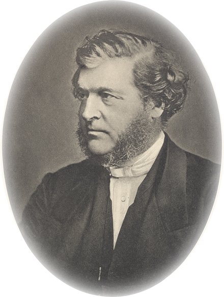
On Pp.367-375 of Hazardous Materials Gail Riplinger spends the best part of eight pages discussing the sinister occult implications of the symbol of a snake swallowing its own tail surrounding a lamp found on the title page of Trench's On the Authorized version of the New Testament as published in America in 1858. Apart from a full-page facsimile of the said sinister title page (she refers to it elsewhere, but as the book has 1200 pages and no index, I can't find it right now), the pages are taken up with speculation as to what led Trench to "Place a serpent on the title page of the book" (P.368). The section is titled "Trench Puts a Serpent on His Title Page!" "Trench's Serpent" is referred to on P. 381, where he is called "the Serpent's Scribe." Sinister, huh?
Sadly she has apperently not even considered the true reason, the reason that first came to my mind as I gazed upon the facsimile title page (not the one illustrated, though the layout is the same). It's the publisher's logo!!!
Yes, the publisher's logo. The publisher was Redfield of New York, whose books from the period all bear the same emblem on the title page, as you can see from my facsimile! A simple google search, well within Ms. Riplinger's ability, confirmed this fact in less time than it takes to go to the John. Check the digital texts found here for confirmation.
Yes, Trench did not select the symbol at all, any more than Shakespeare or any of the other authors published by the Redfield firm. So Riplinger spends pages of speculation and kills more trees in vain. Apparently in all her researches the true solution did not suggest itself, despite the fact that the image is in the usual place for publishers' logos. We might question the religious convictions of Mr. Redfield, but Trench at least is cleared from the accusation of placing an occult symbol on his title page.
Publishers' logos are often interesting things. SCM Press has a burning torch for its logo. Bryntirion Press in Wales has a cross rising from an open Bible. But Redfield was a general publisher, as the volume shown illustrates. Other general publishers with odd logos include Cassell and Co. (Diana the huntress, not to be confused with Diana of the Ephesians), Hutchinson's horned bull's head and the column of Little, Brown. Authors do not choose their publisher's logo.
And this is why I bring up this example. Were it alone it would be bad enough, but it is an example of her determination to put everything she finds in as bad a light as possible, even when there is a perfectly rational and non-sinister explation that does not involve the occult. Like the lead character in Conspiracy Theory, she welds everything she meets with together into a complex web of intrigue and occultism. Like the Templar section (Pp. 843-51), it is a completely irrelevant excusion into fantastic realms (she opens the Templar section with the words, "The movie, the Da Vinci Code, reveals the occult nature and background of Vaughan's Temple," [P.843] by the way). It is this tactic of smearing people with baseless accusations that should never have been made in the first place that earns Riplinger the condemnation that she is a "very dirty writer" to quote John Wesley's condemnation of one of his critics.
[I have now finished reading the book, which caused me, while reading a passage about pyramids on P.996, to burst into gales of laughter in Victoria Coach Station in London. I am sending AV publications details of the publisher's logo business to save embarrassment in any second edition, which I hope will not happen]

1 comment:
You finished it? I hope the kidnappers give your family back, now that you've apparently met their demands. My sympathies.
Post a Comment